Style Field Type

Additional attributes, defaults, and usage example for style fields.

Style fields rely on components being properly annotated.

The style field is a unique field that enables you to attach component style controls to components in the visual editor. This is the only field type that doesn't appear in the page editor sidebar.

Control Type
Inferred from and automatically set by the style being used. See style control types for a list of controls used by component styles.
Stored Value
An object of style values, as selected by the editor.

Usage Example

Consider a HeroSection model that wants to allow editors to control the content width.

  • 1
  • 2
  • 3
  • 4
  • 5
  • 6
  • 7
  • 8
  • 9
  • 10
  • 11
  • 12
  • 13
  • 14
  • 15
  • 16
  • 17
export default {
  models: {
    HeroSection: {
      fields: [
        { name: 'title', type: 'string', required: true },
        {
          name: 'styles',
          type: 'style',
          styles: {
            self: { width: ['narrow', 'wide'] },
            title: { fontSize: '*' },
          },
        },
      ],
    },
  },
}

When highlighting the component, a palette icon will appear, which will enable the editor to set these values.

Component Style Control for HeroSection Component

Stored Values

A style field's is an JSON object representing the shape of the configured options and values chose by the user.

Using the example above, assuming the user chose narrow for self and large for fontSize, the resulting values on the object would look like this:

  • 1
  • 2
  • 3
  • 4
{
  "self": "narrow",
  "fontSize": "large"
}

Some properties like margin and padding allow for multiple values to be selected, in which case the resulting value becomes a nested object.

Required Properties

All style fields require a style property.

style

Object, where the keys are one of:

  • self: Refers to the wrapping element on the model.
  • {fieldName}: (e.g. title) Must match the name property on a field definition within the same model.

These properties (self or {fieldName}) should be an object with properties where the key/name is one of the styles shown throughout this reference, and the value is the set of options available for that style.

Style Control Types

Control types differ depending on the property and the value options available for that property type.

Button

A button control is used when a finite number of text (non-numeric) options can be represented by icons and when multiple values can exist for a style field.

Button Style Control

fontStyle is a good example of a button control, as multiple values may be selected.

Button Group

A button group control is used when a finite number of text (non-numeric) options can be represented by icons and when a single value can be chosen for a style field.

Button Group Style Control

The textAlign field uses a button group, as there are a finite number of options, from which only one can be chosen.

Color

A dropdown of color tiles.

Color Style Control
Color Style Control

A color picker field must specify an array of options with the following properties:

color
The value of the color. This can be a hex value (e.g. #444444) or a variable representing the name of a global style field (e.g. primary).
label
String shown in the dropdown option.
value
The value to store in the content source..
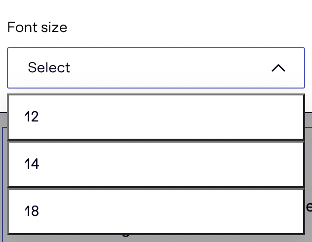
Dropdown controls is a generic control type that produces a single value.

Dropdown Style Control

They are used in a number of scenarios:

  • A list of options can not be represented by a pre-determined set of icons
  • A set of numbers is not conducive to using a slider control (see below)
  • There are too many options to reasonably render a button group

Slider

When numbers can be used for the values options of a field, you can specify a range, which will be rendered in the UI as a slider.

Slider Control
Slider Control

Sliders are configured like so:

*
Any number within the bounds allowed by the property.
a:b

Any number between a and b, in step increments based on the property. (Step is 1 unless otherwise specified.)

Example: 0:4

a:b:n

Any number between a and b, with step increments of n. For example, 0:8:2 is the equivalent of ['0', '2', '4', '6', '8'].

Example: 0:8:2

[...]

An explicit list (array) of of specific values and ranges. Note that each array item can use ranges mentioned above.

Example: ['0', '2', '4:8']

Spacing

Spacing controls allow for setting values on one, more, or all sides of an element.

Spacing Control
Spacing Control

Sliders are configured like so:

*
Any number within the bounds allowed by the property on any or all sides.
a:b

Any number between a and b on any side or all sides, in step increments based on the property. (Step is 1 unless otherwise specified.)

Example: 0:4 is the equivalent of ['0', '1', '2', '3', '4']

a:b:n

Any number between a and b, on any or all sides, with step increments of n.

Example: 0:8:2 is the equivalent of ['0', '2', '4', '6', '8']

{side}a:b(:n)

Any number between a and b, with an optional step increments of n, on a specific side, where {side} can be:

  • b: bottom
  • l: left
  • r: right
  • t: top
  • x: left and right
  • y: top and bottom

Example: x0:8:2 is the equivalent of ['0', '2', '4', '6', '8'], but only for left and right sides. Top and bottom sides won't be set.

[...]

An explicit list (array) of of specific values and ranges. Note that each array item can use ranges mentioned above.

Example: ['0', '2', '4:8'] is the equivalent of ['0', '2', '4', '5', '6', '7', '8']

Mixing Options: Specifying a side will add to the options available, not override them.

Example: ['0:4:2', 't0:20:4'] would result in ['0', '2', '4'] for all sides, except the top, which would have options `['0', '2', '4', '8', '12', '16', '20'] (notice '2' is still present).

Because these values can be configured and set on one or more sides, just as with CSS. The resulting selected values produce an object that can be mapped to CSS classes as necessary.

  • 1
  • 2
  • 3
  • 4
  • 5
  • 6
  • 7
  • 8
{
  "self": {
    "padding": {
      "right": "4",
      "left": "4"
    }
  }
}

Size and Spacing

Size & Spacing Styles Panel

width

Control Type
Allowed Values

An array with one or more of the following: narrow, wide, full

Or use * (as a string) to allow for all values.

  • 1
  • 2
  • 3
  • 4
  • 5
  • 6
  • 7
  • 8
  • 9
  • 10
  • 11
  • 12
  • 13
  • 14
  • 15
  • 16
  • 17
export default {
  models: {
    MySection: {
      fields: [
        { name: 'title', type: 'string', required: true },
        {
          name: 'styles',
          type: 'style',
          styles: {
            self: { width: ['narrow', 'wide'] },
            title: { width: '*' },
          },
        },
      ],
    },
  },
}

height

Control Type
Allowed Values

An array with one or more of the following: auto, full, screen

Or use * (as a string) to allow for all values.

  • 1
  • 2
  • 3
  • 4
  • 5
  • 6
  • 7
  • 8
  • 9
  • 10
  • 11
  • 12
  • 13
  • 14
  • 15
  • 16
  • 17
export default {
  models: {
    MySection: {
      fields: [
        { name: 'title', type: 'string', required: true },
        {
          name: 'styles',
          type: 'style',
          styles: {
            self: { height: ['narrow', 'wide'] },
            title: { height: '*' },
          },
        },
      ],
    },
  },
}

padding

Control Type
Allowed Values
See button group control type options.

Here is an example that allows selecting horizontal padding between 0px and 4px.

  • 1
  • 2
  • 3
  • 4
  • 5
  • 6
  • 7
  • 8
  • 9
  • 10
  • 11
  • 12
  • 13
  • 14
export default {
  models: {
    MySection: {
      fields: [
        { name: 'title', type: 'string', required: true },
        {
          name: 'styles',
          type: 'style',
          styles: { self: { padding: 'x0:4' } },
        },
      ],
    },
  },
}

margin

Control Type
Allowed Values
See button group control type options.

Here is an example that allows selecting horizontal margin between 0px and 4px.

  • 1
  • 2
  • 3
  • 4
  • 5
  • 6
  • 7
  • 8
  • 9
  • 10
  • 11
  • 12
  • 13
  • 14
export default {
  models: {
    MySection: {
      fields: [
        { name: 'title', type: 'string', required: true },
        {
          name: 'styles',
          type: 'style',
          styles: { self: { margin: 'x0:4' } },
        },
      ],
    },
  },
}

Typography

Typography Styles Panel

fontSize

Control Type
Allowed Values

An array with one or more of the following: xx-small, x-small, small, medium, large, x-large, xx-large, xxx-large,

Or use * (as a string) to allow for all values.

  • 1
  • 2
  • 3
  • 4
  • 5
  • 6
  • 7
  • 8
  • 9
  • 10
  • 11
  • 12
  • 13
  • 14
  • 15
  • 16
  • 17
export default {
  models: {
    MySection: {
      fields: [
        { name: 'title', type: 'string', required: true },
        {
          name: 'styles',
          type: 'style',
          styles: {
            self: { fontSize: ['medium', 'large'] },
            title: { fontSize: '*' },
          },
        },
      ],
    },
  },
}

fontStyle

Control Type
Allowed Values

An array with one or more of the following: normal, italic

Or use * (as a string) to allow for all values.

  • 1
  • 2
  • 3
  • 4
  • 5
  • 6
  • 7
  • 8
  • 9
  • 10
  • 11
  • 12
  • 13
  • 14
  • 15
  • 16
  • 17
export default {
  models: {
    MySection: {
      fields: [
        { name: 'title', type: 'string', required: true },
        {
          name: 'styles',
          type: 'style',
          styles: {
            self: { fontStyle: ['normal', 'italic'] },
            title: { fontStyle: '*' },
          },
        },
      ],
    },
  },
}

fontWeight

Note that using this style will also make a Bold button appear alongside the fontStyle and textDecoration buttons. Enabling bold will set the font weight slider to 700.
Control Type
Allowed Values

An array of numeric values representing the a font weight value.

* will produce an array from 100 to 900 in increments of 100.

  • 1
  • 2
  • 3
  • 4
  • 5
  • 6
  • 7
  • 8
  • 9
  • 10
  • 11
  • 12
  • 13
  • 14
  • 15
  • 16
  • 17
export default {
  models: {
    MySection: {
      fields: [
        { name: 'title', type: 'string', required: true },
        {
          name: 'styles',
          type: 'style',
          styles: {
            self: { fontWeight: ['400', '500:900'] },
            title: { fontWeight: '*' },
          },
        },
      ],
    },
  },
}

textAlign

Control Type
Allowed Values

An array with one or more of the following: left, center, right, justify

Or use * (as a string) to allow for all values.

  • 1
  • 2
  • 3
  • 4
  • 5
  • 6
  • 7
  • 8
  • 9
  • 10
  • 11
  • 12
  • 13
  • 14
  • 15
  • 16
  • 17
export default {
  models: {
    MySection: {
      fields: [
        { name: 'title', type: 'string', required: true },
        {
          name: 'styles',
          type: 'style',
          styles: {
            self: { textAlign: ['left', 'center'] },
            title: { textAlign: '*' },
          },
        },
      ],
    },
  },
}

textDecoration

Control Type
Allowed Values

An array with one or more of the following: none, underline, line-through

Or use * (as a string) to allow for all values.

  • 1
  • 2
  • 3
  • 4
  • 5
  • 6
  • 7
  • 8
  • 9
  • 10
  • 11
  • 12
  • 13
  • 14
  • 15
  • 16
  • 17
export default {
  models: {
    MySection: {
      fields: [
        { name: 'title', type: 'string', required: true },
        {
          name: 'styles',
          type: 'style',
          styles: {
            self: { textDecoration: ['none', 'underline'] },
            title: { textDecoration: '*' },
          },
        },
      ],
    },
  },
}

Layout

Layout Styles Panel
Layout Styles Panel

flexDirection

Control Type
Allowed Values

An array with one or more of the following: row, row-reverse, col, col-reverse

Or use * (as a string) to allow for all values.

  • 1
  • 2
  • 3
  • 4
  • 5
  • 6
  • 7
  • 8
  • 9
  • 10
  • 11
  • 12
  • 13
  • 14
  • 15
  • 16
  • 17
export default {
  models: {
    MySection: {
      fields: [
        { name: 'title', type: 'string', required: true },
        {
          name: 'styles',
          type: 'style',
          styles: {
            self: { flexDirection: ['row', 'col'] },
            title: { flexDirection: '*' },
          },
        },
      ],
    },
  },
}

justifyContent

Control Type
Allowed Values

An array with one or more of the following: flex-start, flex-end, center, space-between, space-around

Or use * (as a string) to allow for all values.

  • 1
  • 2
  • 3
  • 4
  • 5
  • 6
  • 7
  • 8
  • 9
  • 10
  • 11
  • 12
  • 13
  • 14
  • 15
  • 16
  • 17
export default {
  models: {
    MySection: {
      fields: [
        { name: 'title', type: 'string', required: true },
        {
          name: 'styles',
          type: 'style',
          styles: {
            self: { justifyContent: ['flex-start', 'center'] },
            title: { justifyContent: '*' },
          },
        },
      ],
    },
  },
}

alignItems

Control Type
Allowed Values

An array with one or more of the following: flex-start, flex-end, center, stretch

Or use * (as a string) to allow for all values.

  • 1
  • 2
  • 3
  • 4
  • 5
  • 6
  • 7
  • 8
  • 9
  • 10
  • 11
  • 12
  • 13
  • 14
  • 15
  • 16
  • 17
export default {
  models: {
    MySection: {
      fields: [
        { name: 'title', type: 'string', required: true },
        {
          name: 'styles',
          type: 'style',
          styles: {
            self: { alignItems: ['flex-start', 'center'] },
            title: { alignItems: '*' },
          },
        },
      ],
    },
  },
}

Frame Style (Borders)

Borders Styles Panel

borderRadius

Control Type
Allowed Values

An array with one or more of the following: none, xx-small, x-small, small, medium, large, x-large, xx-large, full

Or use * (as a string) to allow for all values.

  • 1
  • 2
  • 3
  • 4
  • 5
  • 6
  • 7
  • 8
  • 9
  • 10
  • 11
  • 12
  • 13
  • 14
  • 15
  • 16
  • 17
export default {
  models: {
    MySection: {
      fields: [
        { name: 'title', type: 'string', required: true },
        {
          name: 'styles',
          type: 'style',
          styles: {
            self: { borderRadius: ['small', 'medium', 'large'] },
            title: { borderRadius: '*' },
          },
        },
      ],
    },
  },
}

borderWidth

Control Type
Allowed Values

See slider control for usage.

Default: 0:100:1

  • 1
  • 2
  • 3
  • 4
  • 5
  • 6
  • 7
  • 8
  • 9
  • 10
  • 11
  • 12
  • 13
  • 14
  • 15
  • 16
  • 17
export default {
  models: {
    MySection: {
      fields: [
        { name: 'title', type: 'string', required: true },
        {
          name: 'styles',
          type: 'style',
          styles: {
            self: { borderWidth: '0:10:2' },
            title: { borderWidth: '*' },
          },
        },
      ],
    },
  },
}

borderColor

Control Type
Allowed Values
See color control usage.
  • 1
  • 2
  • 3
  • 4
  • 5
  • 6
  • 7
  • 8
  • 9
  • 10
  • 11
  • 12
  • 13
  • 14
  • 15
  • 16
  • 17
  • 18
  • 19
  • 20
  • 21
  • 22
  • 23
  • 24
  • 25
  • 26
  • 27
  • 28
  • 29
  • 30
export default {
  models: {
    MySection: {
      fields: [
        { name: 'title', type: 'string', required: true },
        {
          name: 'styles',
          type: 'style',
          styles: {
            self: {
              borderColor: [
                {
                  value: 'border-primary',
                  label: 'Primary color',
                  color: '#c81faf',
                },
                {
                  value: 'border-secondary',
                  label: 'Secondary color',
                  color: '#daf851',
                },
                { value: 'border-dark', label: 'Dark color', color: '#444444' },
              ],
            },
          },
        },
      ],
    },
  },
}

borderStyle

Control Type
Allowed Values

An array with one or more of the following: solid, dashed, dotted, double, none

Or use * (as a string) to allow for all values.

  • 1
  • 2
  • 3
  • 4
  • 5
  • 6
  • 7
  • 8
  • 9
  • 10
  • 11
  • 12
  • 13
  • 14
  • 15
  • 16
  • 17
export default {
  models: {
    MySection: {
      fields: [
        { name: 'title', type: 'string', required: true },
        {
          name: 'styles',
          type: 'style',
          styles: {
            self: { borderStyle: ['solid', 'dashed'] },
            title: { borderStyle: '*' },
          },
        },
      ],
    },
  },
}