Enum Field Type
Additional attributes, defaults, and usage example for enum fields.
Usage Example
Here is an example that shows a field called backgroundColor that lets an editor choose between a primary and secondary color.
1234567891011121314151617
The default control type is a dropdown. See control types below for additional rendering options.

Control Types
Control types affect how the field is rendered, as well as how options are defined.
button-group
A button group creates a horizontal list of buttons, where only one can be selected at a time.
1234567891011121314151617

dropdown (default)
Dropdown is the default control type. It renders a simple dropdown control that lists the labels and stores the values.
123456789101112131415

- If field is not required, dropdown will render a None option to allow for clearing the value. Otherwise, only the options are rendered.
palette
A palette allows for a series of color swatches, where you can control the text, background, and border colors.
1234567891011121314151617181920212223242526
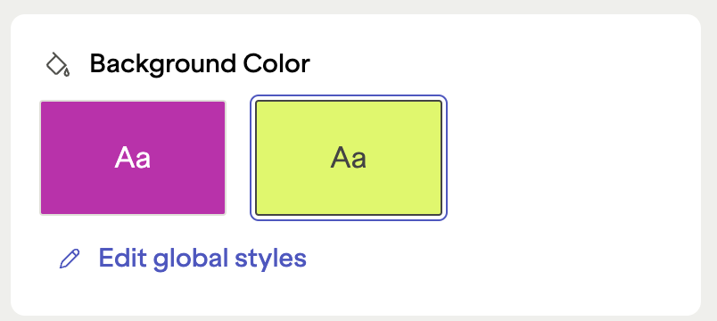
You can also use variables from your global styles object. This is an effective way to ensure consistency in color choices throughout your project. Here's an example that let's editors choose from two colors set as
primaryandsecondaryin global styles.1234567891011121314151617181920212223242526
Enum Palette Control with Dynamic Values

palette-colors
While palette shows single color combinations, palette-colors is designed to show more complex color combinations.
12345678910111213141516171819202122232425

Like the
palettecontrol, you can also use variables from your global styles object. This is an effective way to ensure consistency in color choices throughout your project.123456789101112131415161718192021
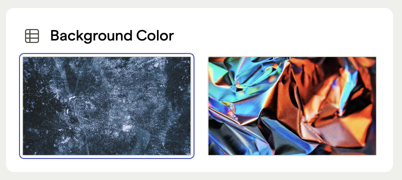
thumbnails
You can also list a series of image tiles from images that are loaded directly from your repository.
1234567891011121314151617181920212223